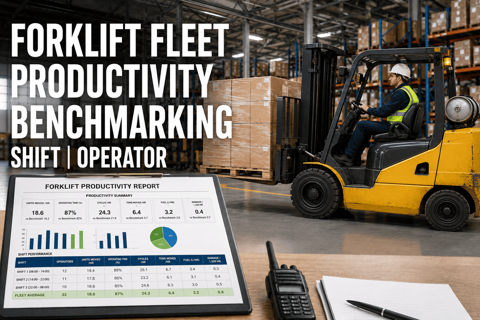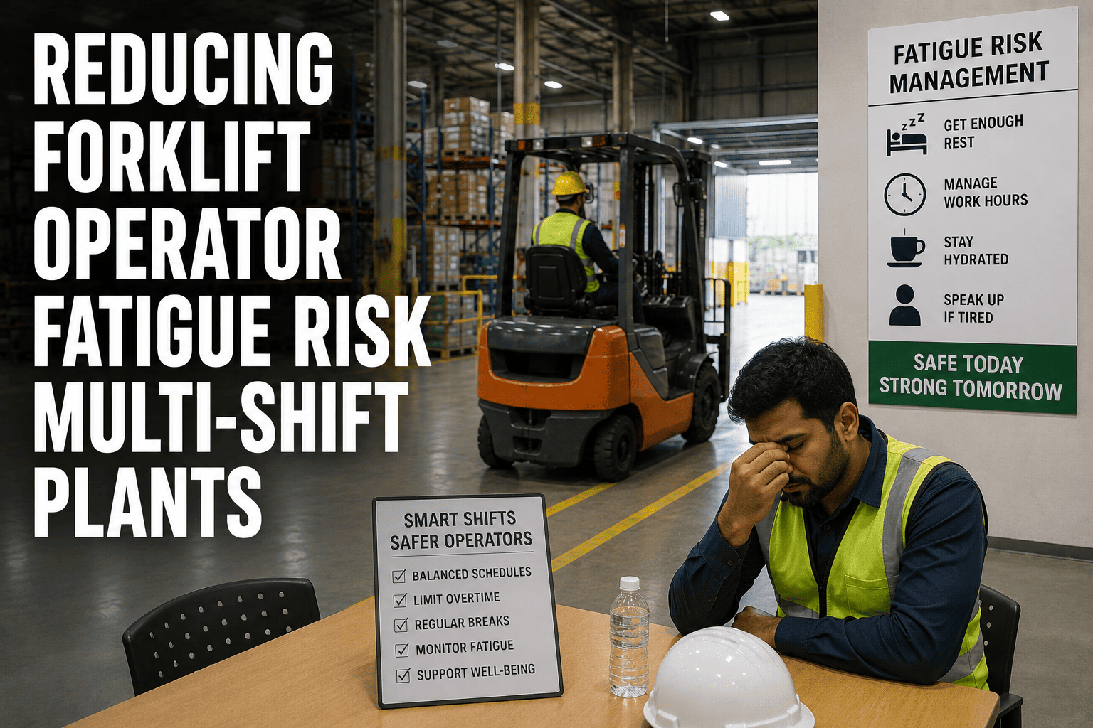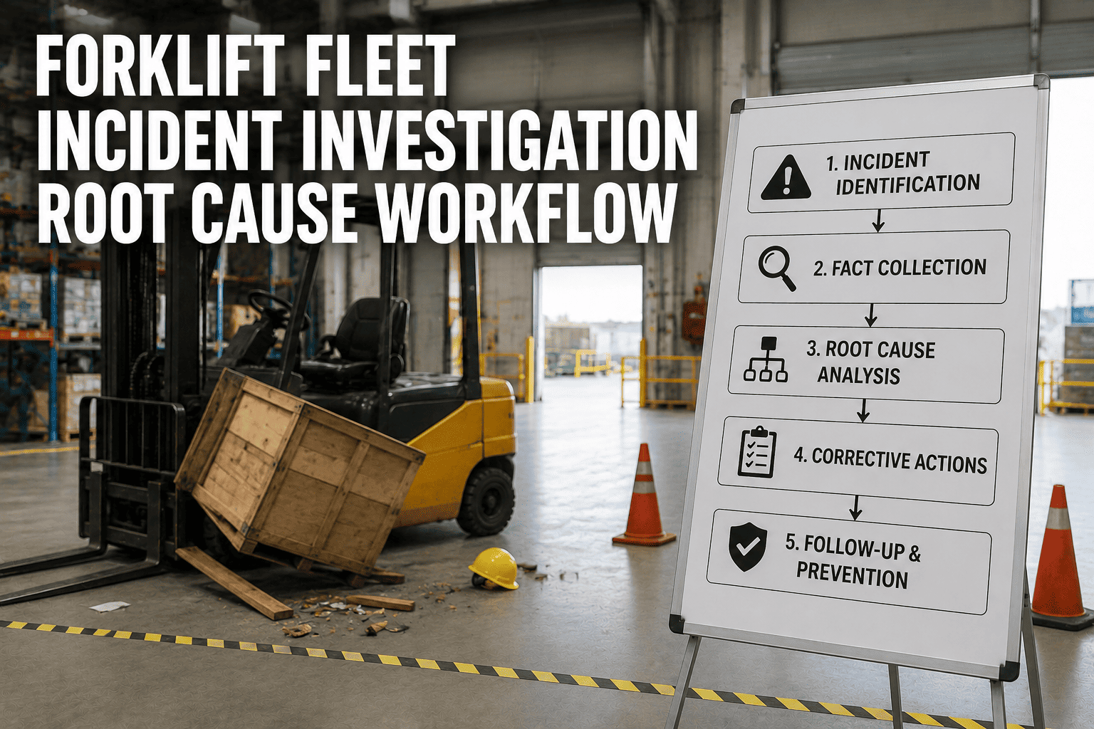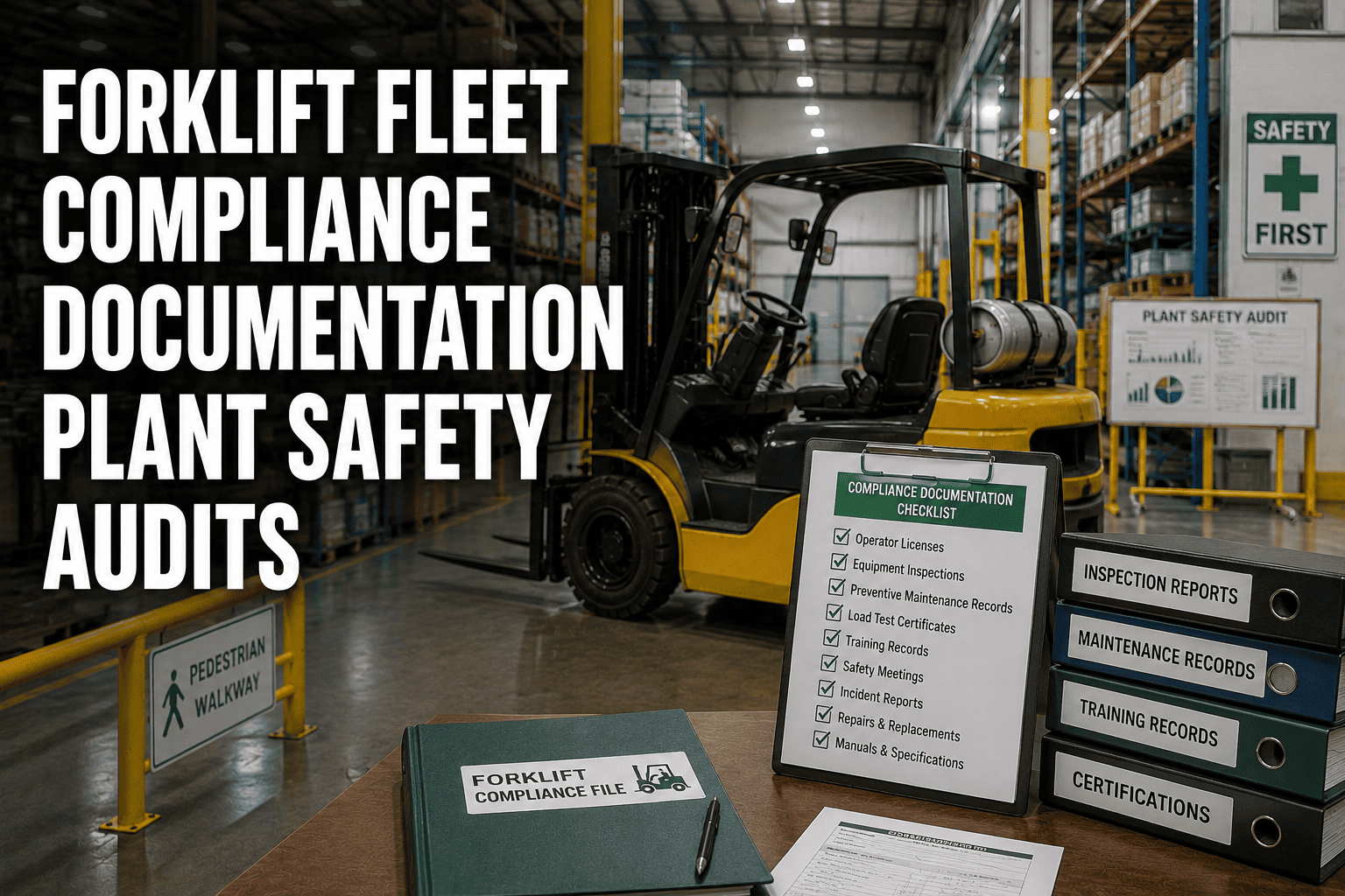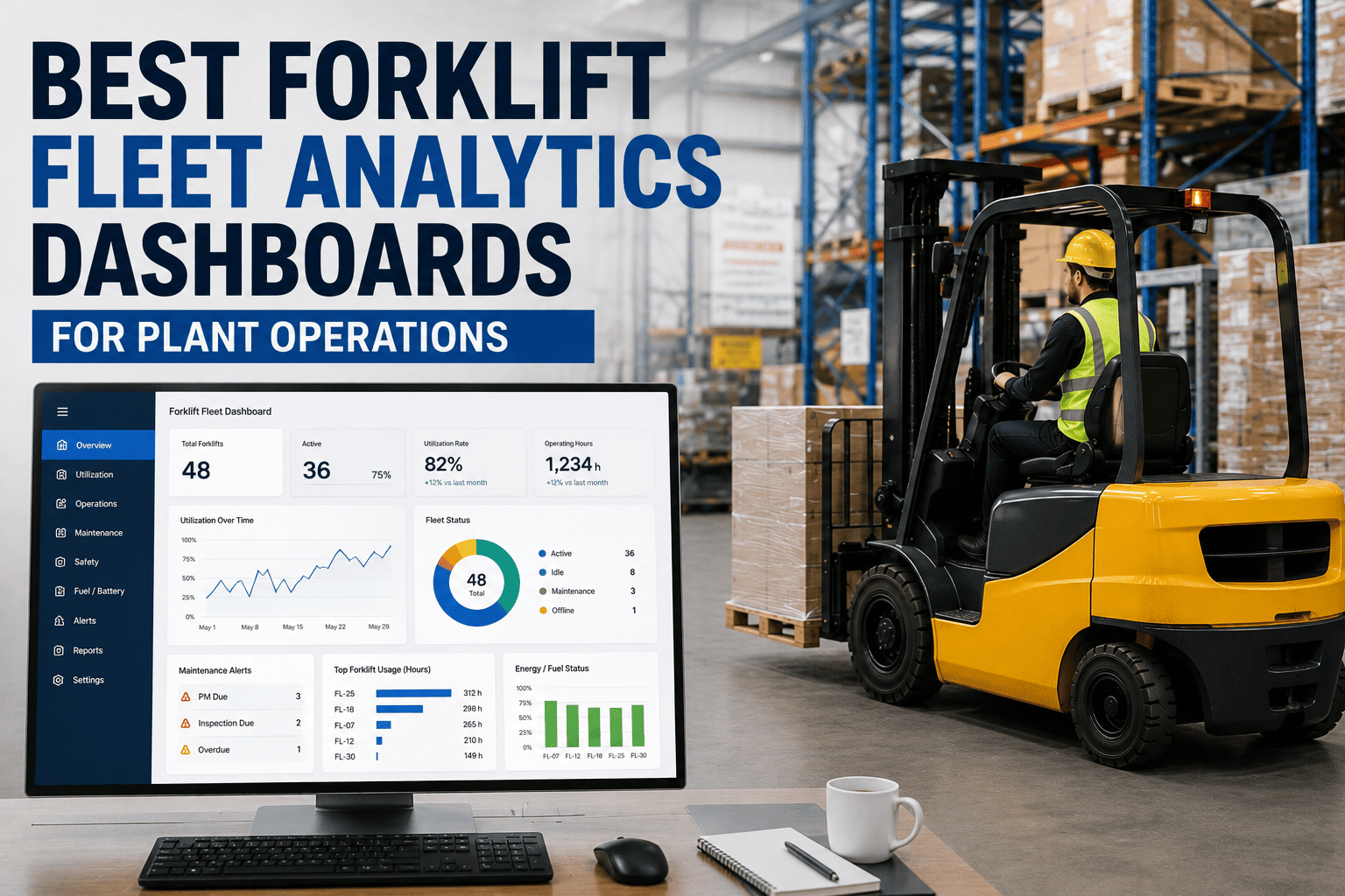
Most plant operations managers can tell you exactly how many units left the production line yesterday, but ask them how many of their forklifts sat idle during second shift, or which truck logged the most hard impacts last month, and the answer is usually a guess. Forklifts move nearly every input and output across a manufacturing floor, yet they remain the least measured asset in most plants. A real analytics dashboard changes that by turning scattered telematics data into a single live view of utilization, uptime, and safety that a plant manager can act on the same day it appears.
The best forklift fleet analytics dashboards for plant operations managers combine live utilization rates by shift and zone, uptime and downtime root-cause tracking, and impact or safety event logging in one screen. Platforms like FleetRabbit pull this directly from onboard telematics, helping plants right-size their fleet, hit 98 percent or higher uptime, and cut impact-related maintenance by 30 to 40 percent within 90 days.
The Three Numbers Every Plant Manager Should See Daily
A dashboard built for plant operations does not need fifty charts. It needs to answer three questions clearly enough that a manager can make a decision before the next shift starts: how hard is each truck actually working, how much of the fleet is available right now, and where is risk building up before it becomes an incident.
Why This Matters More on the Plant Floor Than Anywhere Else
Unlike a road fleet, a plant forklift fleet operates in a fixed, high-traffic space shared with people, product, and machinery. A dashboard that only reports totals at the end of the month cannot prevent the near-miss that happens on Tuesday afternoon. Operations managers who see utilization, uptime, and safety data live are the ones who can shift a route, pull a truck for inspection, or retrain an operator before a small pattern becomes a costly incident. Teams that want this level of visibility can start a free trial and see their own plant floor data within a day of connecting telematics.
From Spreadsheet Reports to Live Decisions
The old way
A maintenance coordinator pulls hour meter readings once a week, cross-references a spreadsheet, and schedules service based on a fixed calendar regardless of how hard a truck actually ran.
The dashboard way
Runtime hours, fault codes, and impact events stream continuously, so maintenance is triggered by actual usage and problems surface the moment they start rather than at the next manual check.
FleetRabbit connects to your forklift telematics and streams utilization, downtime cause, and impact data to a single plant floor dashboard updated in real time, so decisions happen before the next shift instead of after the month closes.
What Each Metric Category Actually Reveals
Raw data is only useful when it points to a decision. The table below breaks down what each core metric category in a good forklift analytics dashboard actually tells a plant operations manager, and what action it typically drives.
| Metric Category | What It Measures | What It Reveals | Typical Action Taken |
|---|---|---|---|
| Utilization Rate | Productive time versus idle time per truck, per shift, per zone | Which trucks are overworked and which are sitting idle most of the shift | Right-size the fleet or reassign trucks across zones |
| Uptime and Downtime Split | Planned versus unplanned stoppage hours by vehicle | Whether maintenance is running proactively or reacting to failures | Shift service scheduling from calendar-based to hour-based triggers |
| Impact and Safety Events | Frequency, severity, and location of logged impacts | Which operators, zones, or shifts carry the highest incident risk | Targeted operator coaching or traffic flow redesign |
| Cost per Unit Moved | Combined fuel or energy, maintenance, and labor cost against throughput | Whether fleet size and equipment mix match actual production demand | Adjust fleet size, retire underused units, or reallocate capital |
Four Signs Your Current Dashboard Is Not Enough
Bringing Maintenance, Utilization, and Safety Into One View
Plants that manage utilization in one system, maintenance in another, and safety incidents in a paper binder end up making three separate decisions about the same truck. An operations manager who can see all three side by side for a single vehicle gets a far more accurate picture, such as a truck with declining utilization, rising fault codes, and a recent impact event, which together suggest a candidate for early replacement rather than another repair. Facilities ready to consolidate this view can book a demo and walk through their own plant floor data with the FleetRabbit team.
FleetRabbit gives plant operations managers a single dashboard covering fleet utilization, downtime root cause, and impact event tracking, so fleet sizing and safety decisions are backed by live data instead of a weekly report.
Frequently Asked Questions
FleetRabbit gives plant operations managers one live dashboard for utilization, uptime, and safety across every forklift on the floor. See your own plant data within a day, with no credit card required.