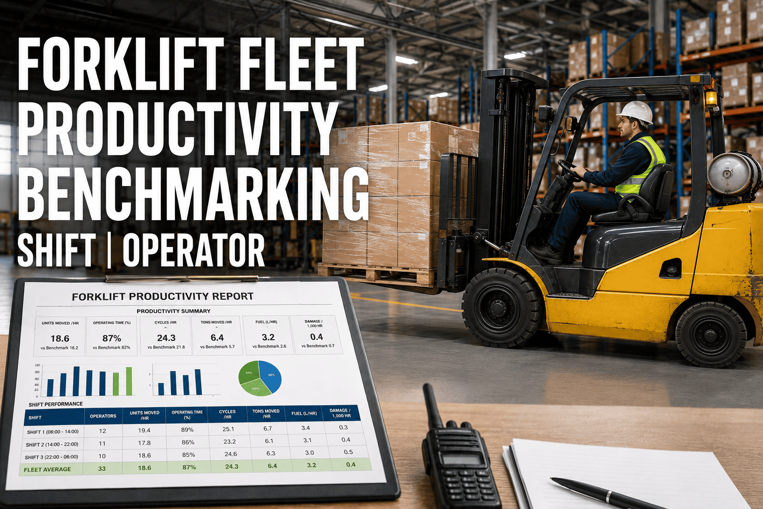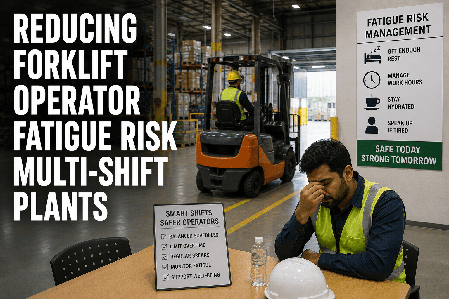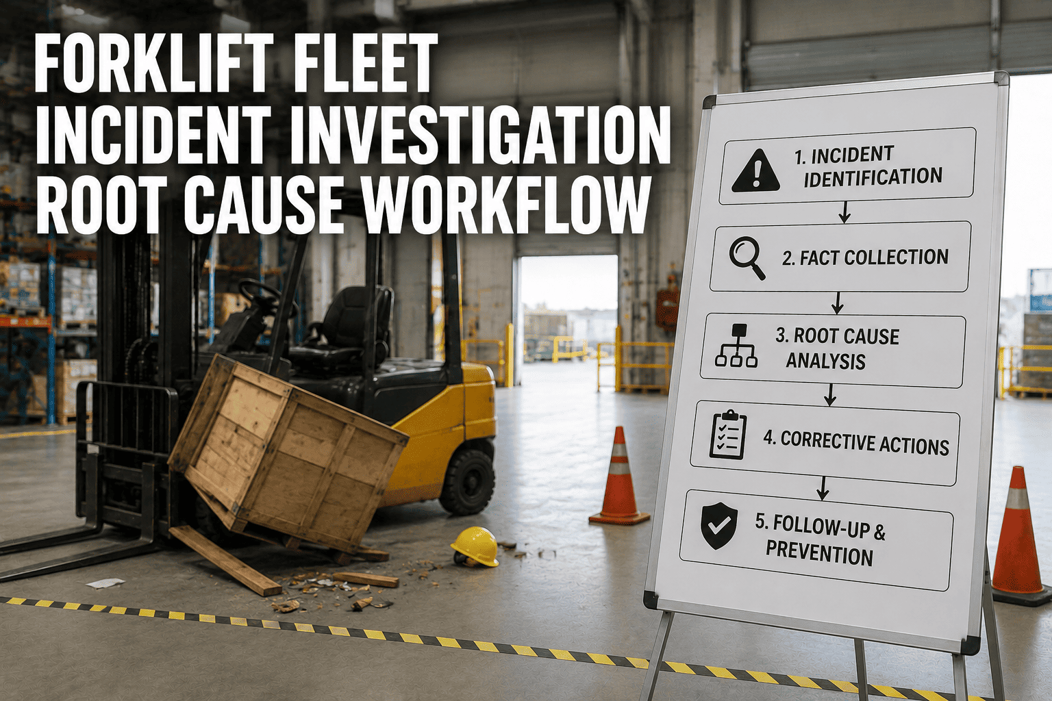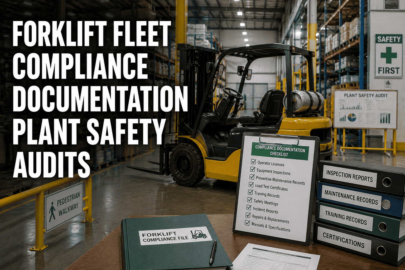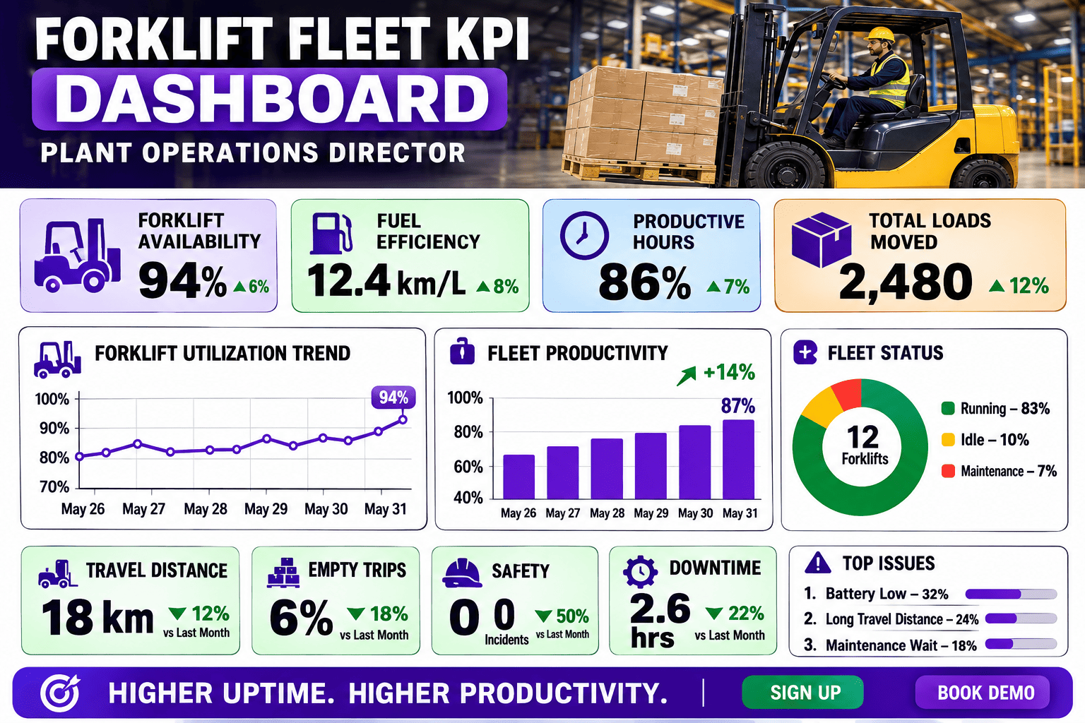
Every plant floor already has KPI data. The problem is where it lives: one number in a supervisor's notebook, another in a maintenance spreadsheet, a third buried in a fuel card statement nobody reconciles until month end. By the time an operations director sits down to build a board update, half the morning is spent chasing numbers instead of acting on them. The plants that win are not the ones collecting more data. They are the ones that can see uptime, utilization, cost per hour, and safety on one screen before the first coffee of the day.
A forklift fleet KPI dashboard consolidates uptime, utilization rate, cost per operating hour, and safety incident data into one live view, replacing scattered spreadsheets and end-of-month reports. Directors who track these metrics in real time typically report meaningfully lower cost per hour and higher fleet availability than teams relying on manual reporting. See what a live dashboard looks like across your own fleet with a free FleetRabbit trial.
The Four KPIs That Actually Reach the Boardroom
Plant floors track dozens of numbers, but only a handful survive the trip to a director's desk. These four form the backbone of almost every executive fleet review, because each one converts directly into a dollar figure leadership understands.
Why Floor Reports Don't Survive the Trip Upstairs
A supervisor's shift log answers a different question than a director's board deck, and forcing one into the other is where most fleet reporting breaks down. Floor data is granular and immediate. Director data needs to be aggregated, trended, and tied to cost, and manually converting one into the other every month is where hours disappear.
The Translation Problem
A maintenance spreadsheet showing forty work orders means nothing to a director until it is translated into cost per hour and compared against last quarter. That translation step, done manually, is slow, error-prone, and usually stale by the time it reaches a review meeting.
The Fix: One Live Source of Truth
A proper dashboard performs that translation automatically and continuously, so the number a director sees on a Tuesday morning is the same number a supervisor was looking at an hour earlier, not a stale figure recalculated once a month.
| View | Floor-Level Report | Director-Level Dashboard |
|---|---|---|
| Update Frequency | End of shift, entered manually | Continuous, updated automatically from telematics |
| Format | Raw event counts and work orders | Trended KPIs tied directly to cost and revenue impact |
| Scope | Single shift or single vehicle | Fleet-wide, by zone, shift, and site |
| Time to Insight | Days, once someone compiles the report | Minutes, visible the moment a trend shifts |
FleetRabbit pulls uptime, utilization, cost per hour, and safety data straight from your telematics into a live executive dashboard, no monthly spreadsheet build required. Try it free with your current fleet, or walk through a live dashboard with our team.
Building One Dashboard from Scattered Data
Most plants already have the raw ingredients for a strong dashboard scattered across three or four systems. The work is not collecting new data, it is connecting what already exists into one continuous feed.
Telematics as the Data Backbone
Onboard sensors already capture engine hours, location, speed, and impact events every few seconds. Routing that stream into a single dashboard removes the need for anyone to manually log utilization or safety events again.
Connecting Maintenance and Fuel Systems
Work order histories and fuel or energy consumption data complete the cost-per-hour picture. Once these feeds sit alongside telematics data, cost per hour recalculates itself automatically instead of waiting for a spreadsheet reconciliation.
Benchmarks That Prove ROI to the C-Suite
Numbers move budget conversations faster than narratives do. Fleets that shift from monthly manual reporting to real-time KPI tracking commonly report double-digit reductions in cost per operating hour, alongside fleet uptime climbing well past the 95 percent mark that top-quartile operations target. A single percentage point of uptime recovered across a mid-size fleet routinely translates into six figures of added revenue capacity annually, which is the kind of number that turns a dashboard from a nice-to-have into a budget line every operations director can defend. If you want to see these benchmarks applied to your own fleet size and shift pattern, it is worth taking a few minutes to book a demo with the FleetRabbit team.
An operations director should never have to choose between running the floor and building the report that explains it. A single live dashboard removes that trade-off entirely, turning uptime, utilization, cost per hour, and safety into numbers you can defend in any meeting without opening a spreadsheet first. If your plant is ready to replace the monthly scramble with a live view, start a free trial with FleetRabbit or book a short demo to see your own fleet's KPIs on one screen.
FleetRabbit brings uptime, utilization, cost per hour, and safety data together in one live dashboard built for plant operations directors. Get started today, no credit card required.