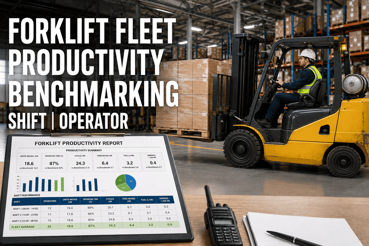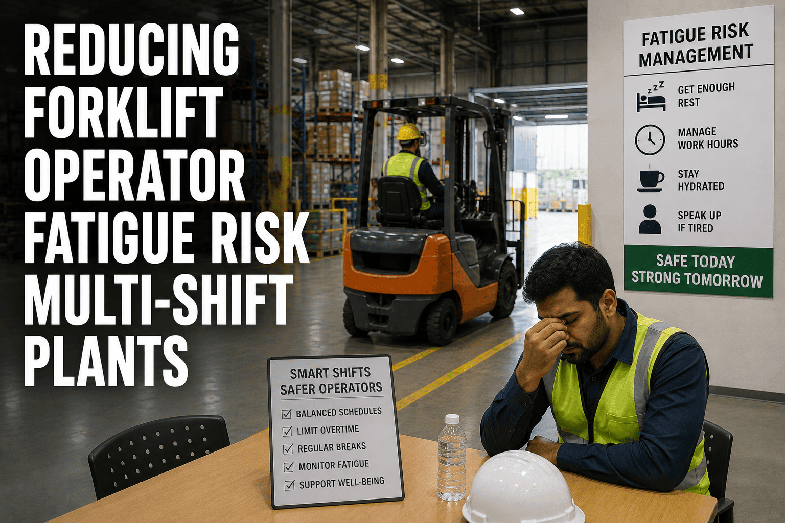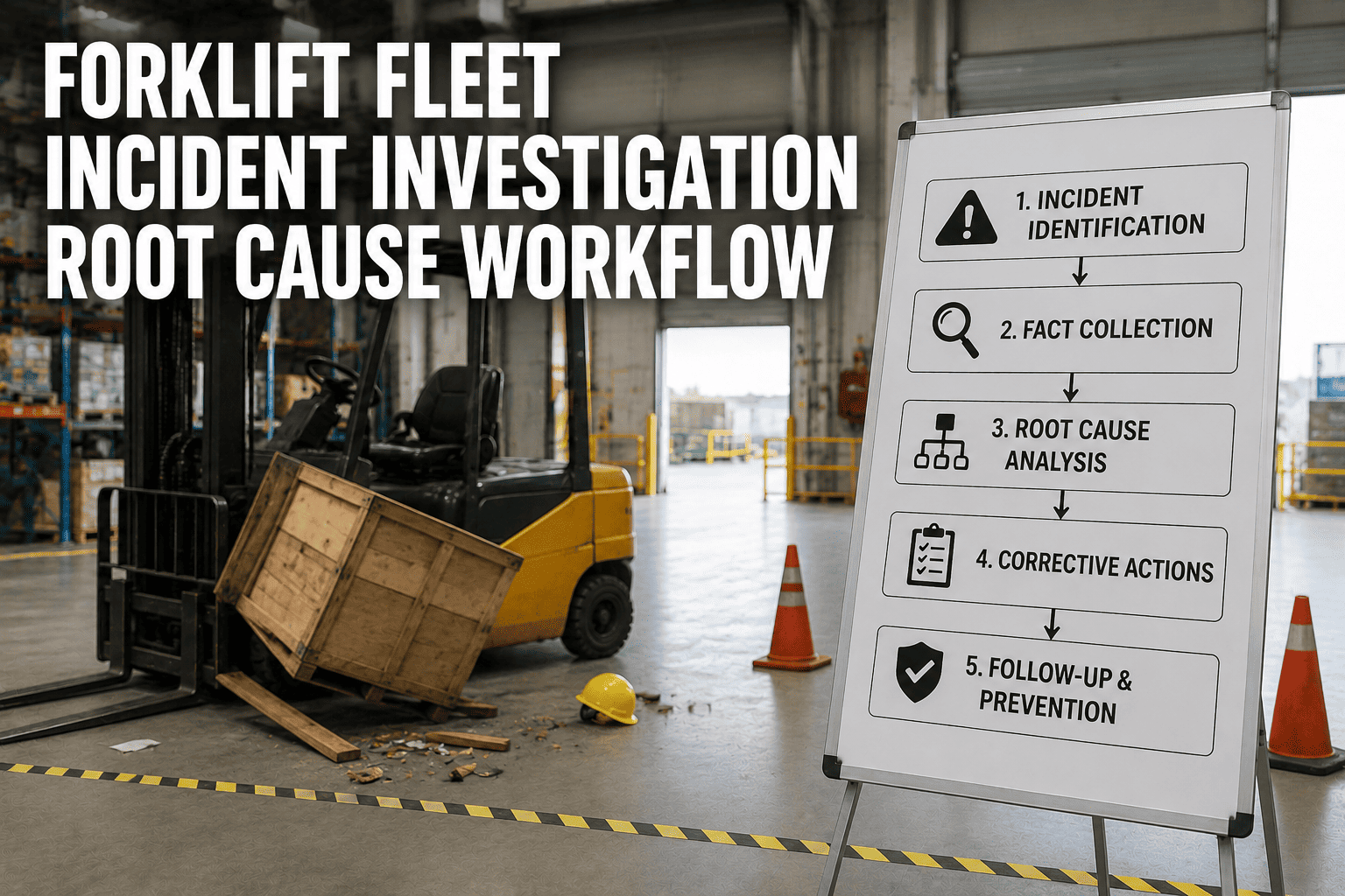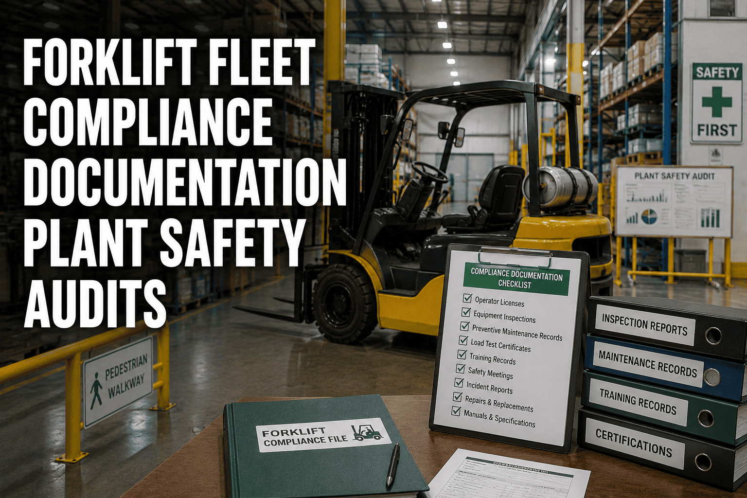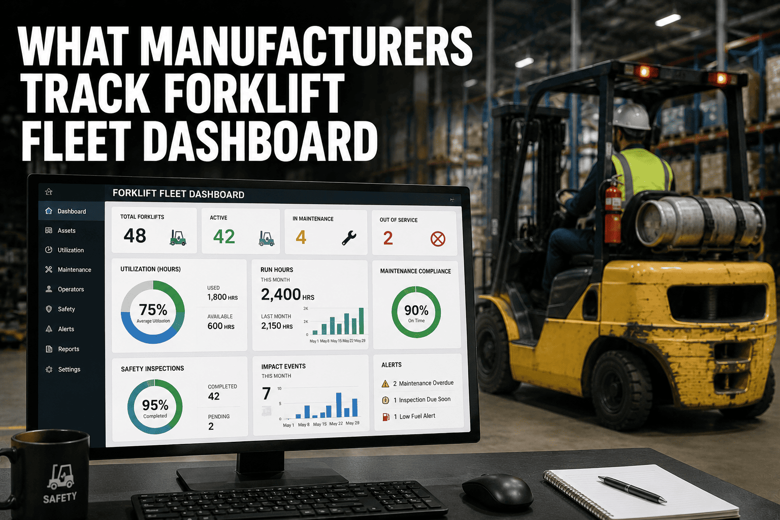
Open most plant forklift dashboards and you'll find a wall of numbers that nobody actually checks before a shift starts. Battery voltage, tire pressure history, six months of fault codes, all competing for attention with nothing telling the plant manager what to act on today. A dashboard that actually gets used does the opposite. It leads with four numbers that explain the health of the fleet at a glance, and lets everything else live one click deeper. Manufacturers who get this right stop reacting to breakdowns and start making decisions from data instead of gut feel. If you want to see what a working version of this looks like against your own forklift fleet, you can book a demo with the FleetRabbit team.
A forklift fleet dashboard should lead with four numbers: uptime percentage, utilization rate, cost per operating hour, and safety impact events. Uptime above 95 percent, utilization between 60 and 80 percent of shift hours, and a falling cost-per-hour trend all indicate a healthy fleet. Everything else — MTTR, PM compliance ratio, battery health, fault code history — supports those four but shouldn't compete with them for attention on the main screen.
The Four Numbers Every Forklift Dashboard Should Lead With
Every other metric on a fleet dashboard exists to explain one of these four. Get these right at the top of the screen and a plant manager can assess fleet health in under thirty seconds.
Uptime Percentage
Uptime measures the share of scheduled operating time a forklift is actually available for work, not sitting in the shop or waiting on parts. Plants running hour-based service tracking and real-time fault code monitoring routinely reach 98.7 percent uptime, while reactive plants relying on fixed calendar service often sit well below 95 percent without realizing how much production time they're losing.
Utilization Rate
Utilization tracks what percentage of available shift time a forklift spends in productive motion, not idle or unassigned. The accepted healthy range sits between 60 and 80 percent of shift hours. Below that band usually means the plant is running more forklifts than the workload needs, while sustained utilization above 80 percent tends to accelerate wear and raise breakdown risk on the units carrying the extra load.
Cost Per Operating Hour
This single figure rolls fuel or charging cost, maintenance spend, and downtime impact into one number that's easy to compare across units, shifts, and sites. A rising cost-per-hour trend on a specific forklift is usually the earliest warning sign that a unit is heading toward major repair or replacement, well before it actually breaks down.
Safety Impact Events
Every collision or hard contact above a set threshold should log automatically with a timestamp, location, and operator ID. Plants that started tracking this metric alongside utilization data have reported dramatic reductions in accident and damage costs once impact patterns were tied to specific operators, zones, or shifts instead of treated as isolated incidents.
FleetRabbit surfaces uptime, utilization, cost per hour, and safety events on a single live screen, with fault codes and PM status one click away instead of buried in a report nobody opens.
Reading The Numbers: What Good, Average, And Concerning Look Like
A number on its own doesn't tell you anything. What matters is where it sits against a benchmark, so a manager glancing at the dashboard knows instantly whether to act.
| Metric | Healthy Range | Needs Attention | Common Cause |
|---|---|---|---|
| Uptime | 95% to 98.7% | Below 90% | Calendar-based PM instead of hour-based, delayed fault response |
| Utilization | 60% to 80% | Below 40% or sustained above 85% | Fleet oversized or undersized for current workload |
| Cost Per Hour | Stable or falling trend | Rising three months in a row | Aging unit, deferred repairs, or emergency service premiums |
| Impact Events | Isolated, logged, trending down | Repeated by same operator or zone | Training gap, congestion, or visibility issue in a specific area |
Beyond The Big Four: Supporting Metrics Worth A Second Screen
Once the lead numbers are visible, a few supporting metrics explain why they're moving.
Mean Time To Repair
MTTR measures how long a forklift stays down once it's flagged for repair. Best-in-class plants keep this under six hours for planned work, since every additional hour compounds the uptime number sitting at the top of the dashboard.
Planned Versus Unplanned Maintenance Ratio
This ratio reveals whether the maintenance program is proactive or reactive. A high share of unplanned work is usually the root cause behind both a falling uptime number and a rising cost-per-hour trend.
Fault Code Response Time
Tracking how quickly a logged fault code turns into a work order shows whether developing issues are being caught early or sitting unnoticed until the next scheduled inspection.
Turning Dashboard Numbers Into Daily Decisions
A dashboard only earns its place on a plant manager's screen if it changes what happens next. The most effective forklift dashboards are built around three simple habits.
Check the four lead numbers every morning
A thirty-second glance at uptime, utilization, cost per hour, and impact events flags whether yesterday's shift needs follow-up before the next one starts.
Drill into the outlier, not the average
A fleet-wide utilization average can hide two or three forklifts running far above or below the healthy range. The dashboard should make those outliers obvious, not bury them in an aggregate number.
Feed the trend, not just the snapshot
A single day's cost-per-hour figure means little. A three-month trend on the same number is what actually predicts which unit is heading toward major repair. Plants that shift from static reports to a live, trend-aware dashboard typically catch these patterns weeks before a breakdown, rather than after one. You can see this kind of trend view running on a live fleet by choosing to sign up for a free trial today.
FleetRabbit turns uptime, utilization, cost per hour, and safety data into trend-aware alerts so plant managers know exactly which forklift needs attention, and why, before it becomes a breakdown.
Frequently Asked Questions
Stop scrolling through reports that don't lead anywhere. FleetRabbit surfaces uptime, utilization, cost per hour, and safety events on one live screen, so every plant manager knows exactly where to look.