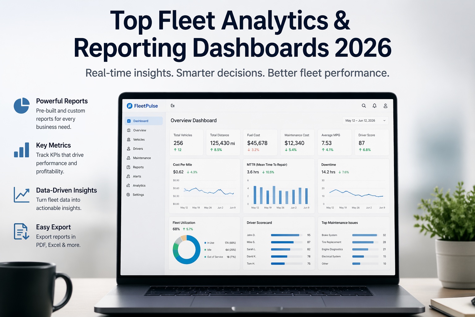
Fleet managers in 2026 are drowning in data and starving for insight. GPS pings, fuel receipts, maintenance invoices, driver logs, inspection records, compliance docs — scattered across six disconnected systems, merged weekly into a spreadsheet that is already outdated the moment it is built. And the cost of that blindness is measurable. The American Transportation Research Institute puts the 2024 fleet cost-per-mile at $2.26 up $0.62 since 2020. Unplanned downtime runs $448 to $760 per vehicle per day, with 78% of it preventable. The average fleet wastes 5–10% of its annual budget on underutilized assets and poor PM compliance alone. The fleets beating industry benchmarks by 30% are not working harder — they are seeing faster. They track the right KPIs in real time, organized by priority, on dashboards designed for decision-making instead of data-dumping. This guide breaks down what fleet reporting and analytics dashboard software actually does, the four KPI pillars every fleet must track, the 2026 benchmarks that separate winners from bleeders, and how Fleet Rabbit turns scattered fleet data into executive-ready insight in real time.
From Raw Data to Decisions — in Under 10 Seconds
Your fleet generates a million data points a week. A great analytics dashboard surfaces the four that matter — Cost Per Mile, Utilization, Downtime, PM Compliance — with drill-down depth for everything else. No more weekly spreadsheet rebuilds.
Why Fleet Analytics Dashboards Matter More Than Ever in 2026
The gap between fleets that outperform and fleets that struggle is not fleet size, driver quality, or equipment age — it is visibility. A 50-vehicle fleet with real-time KPI tracking consistently produces lower cost-per-mile, higher vehicle availability, and cleaner CSA scores than a 200-vehicle fleet running on monthly spreadsheet reports. The math is brutal, and it is not improving.
Fleets that deploy proper KPI dashboards typically reduce cost-per-mile by 18–26% in the first 12 months. The savings come from three compounding wins: fewer emergency repairs (PM compliance goes up), less fuel waste (idle time drops), and tighter MTTR (faster repair cycles). All three are invisible without analytics. See Your Live Fleet Numbers in 30 Minutes →
The 4 KPI Pillars Every Fleet Dashboard Must Track
Fleet performance is not a single metric — it is a system of four interconnected pillars. A fleet that obsesses over cost but ignores safety, or tracks utilization while neglecting maintenance, always pays for the gap. A balanced analytics dashboard covers all four quadrants because they are causally linked: poor maintenance drives fuel costs up, low utilization masks high cost-per-mile, and safety incidents destroy insurance economics.
The profitability layer. Every decision — replace or repair, hire or contract, accept or decline — traces back to these numbers.
The capacity layer. Are your vehicles producing revenue or parked in the yard? Are routes tight or leaking margin?
The reliability layer. MTBF trending is the most predictive metric in all of fleet management — declining 15% quarter-over-quarter means a breakdown is coming.
The risk layer. Insurance underwriters, shippers, and FMCSA all watch these — and they directly affect your premium and load access.
The 4 "North Star" KPIs — Your Daily 10-Second Health Check
Tracking 25 KPIs feels thorough, but it actually causes "dashboard fatigue" — the phenomenon where managers stop looking at reports because they contain too much data with equal visual weight. Industry best practice in 2026 is a layered dashboard: 4 North Star KPIs shown large at the top, 4–6 diagnostic metrics in a secondary band, and drill-down to everything else on click.
The single most correlated KPI with fleet profitability. Total operating costs divided by total miles. Fleets with CPM below $0.42 outperform peers on every other metric simultaneously.
Active hours divided by available hours. A vehicle at 52% utilization while others are over-dispatched represents roughly $1,800/month in asset waste — a number most fleets never see.
The most expensive metric in fleet operations. On a 50-vehicle fleet running at 4.2% unplanned downtime, annual loss approaches $420,000. Dropping to 2% saves half of that immediately.
The leading indicator for 6 of the other 24 KPIs. Improving from 70% to 94% reduces breakdowns by 50%, cuts emergency repair spend, and drops CPM within 90 days. Only 28% of fleets hit 95%+.
Your Fleet Already Has the Data. It Is Just Hiding.
Fleet Rabbit connects to your telematics, fuel cards, and work order history — and produces all four North Star KPIs plus 20+ diagnostic metrics in real time. No spreadsheets. No manual pulls.
2026 Benchmarks: How Your Numbers Should Actually Look
A KPI without a benchmark is just trivia. Here are the 2026 industry benchmarks and best-in-class targets from fleet analytics studies across 1.2 million vehicles. Use these to calibrate your own dashboard thresholds and identify your most urgent improvement opportunities.
| KPI | Industry Average | Best-in-Class | Your Upside |
|---|---|---|---|
| Cost per Mile | $0.58 – $0.72 | < $0.42 | 18–26% reduction |
| PM Compliance Rate | 55–70% | 95%+ | Reduces breakdowns 50% |
| MTTR (Mean Time to Repair) | 3.8 – 5.2 hrs | 1.6 – 2.4 hrs | ~50% cycle time savings |
| MTBF (Mean Time Between Failures) | 220 – 380 hrs | 500+ hrs | 2x asset reliability |
| Fleet Availability | 88–92% | 95%+ | Each 1% = real revenue |
| Unplanned Downtime Rate | 4.2 – 6.8% | < 2% | $210K–$420K/year on 50 trucks |
| Planned vs Unplanned Ratio | 55 : 39 | 80 : 20 | Emergency repairs = 3–9x cost |
| First-Time Fix Rate | 72–80% | 90%+ | Each 5% cuts shop backlog 20% |
| Maintenance ROI | 1.8 – 2.4x | 4.8 – 6.2x | Justifies every investment |
The gap between "industry average" and "best-in-class" is where analytics dashboards pay for themselves many times over. Most fleets do not know where they sit because they have never had the visibility to measure. Request a Benchmarking Walkthrough →
Spreadsheet Reporting vs Real-Time Analytics: The Before/After
Every fleet I meet has the same story: a well-meaning safety manager, maintenance lead, or ops director pulls exports from ELD, fuel card, and CMMS every Friday, then spends 4–6 hours stitching them into a dashboard that leadership sees Monday morning — already 72 hours stale. Here is what changes when that workflow becomes a platform.
Manual Spreadsheet Reporting
- ✕ 4–6 hours per week stitching exports together
- ✕ Data already 72 hours old by the time it lands
- ✕ No drill-down — if the number looks wrong, another export
- ✕ Human error in formulas, copy-paste breaks
- ✕ One person owns the report; they go on vacation, you're blind
- ✕ No alerts — drift invisible until monthly review
- ✕ Executive says "show me trend" — next week
Real-Time Analytics Dashboard
- ✓ Updated live from telematics + fuel + CMMS
- ✓ Zero manual hours per week — runs itself
- ✓ Drill-down by vehicle, driver, route, technician
- ✓ Automated threshold alerts — know before it hurts
- ✓ Every team member sees role-appropriate view
- ✓ Mobile-first — review fleet health on the yard walk
- ✓ One-click Excel export for any stakeholder request
Essential Features of a Fleet Analytics Platform
Not every dashboard tool is built for fleet operations. Use this checklist to separate real fleet analytics platforms from generic BI dashboards repurposed for transportation.
Pulls from telematics (Geotab, Samsara, Verizon Connect), fuel card providers, CMMS, and DVIR systems — all in one dataset. No re-entry, no manual reconciliation.
Executive sees CPM and fleet availability. Dispatch sees live utilization and driver status. Shop lead sees work order backlog and MTTR. Every role gets what it needs, not everyone's everything.
When CPM crosses target, MTTR drifts up, or a vehicle's MTBF trends down 15%, push alerts fire to the right person's phone. Exception-based management, not daily dashboard-staring.
Tap fleet-level CPM → see per-vehicle CPM → tap a high-cost vehicle → see work order and fuel history for that unit. Answer diagnostic questions in three clicks, not three hours.
Today, 7/30/90-day windows, or custom ranges. Compare this quarter to last, this year to last year, this vehicle to the fleet average. Context turns numbers into decisions.
Auditor asks for records? Board wants a slide? Export any dashboard to Excel or PDF in seconds — formatted, branded, ready to send without manual cleanup.
Fleet decisions happen on yard walks, site visits, and late-night incidents. A dashboard that only works on desktop forces managers back to the office — which defeats the point of real-time.
Not just "MTBF is 380 hours today" but "MTBF on truck 42 has dropped 15% over 90 days — schedule inspection now." AI-driven insights turn raw data into action recommendations.
Fleets that check every box above move from reactive management to predictive operations. Schedule a Demo to See All 8 Features Live →
How Fleet Rabbit's Analytics Dashboard Delivers End-to-End Visibility
Fleet Rabbit was built for fleet managers who want answers, not reports. Three integrated dashboards — Inspection, Maintenance, and Fuel — give you live operational visibility with drill-down depth and one-click export. Every KPI updates automatically from your existing data sources, and the interface is designed to surface the answer to "what needs my attention today?" in under 10 seconds.
Track total inspections, good vs faulty counts, corrective action status (Taken, Partial, Not Taken, N/A), and linked work orders auto-generated from defects. Views available: Overview, Datewise, By Inspector, By Fleet, Fleet Category, By Checklist.
Six core KPIs at a glance: Parts Cost, Labor Cost, Total Cost, MTTR (hourly precision), Unplanned Work Order %, Overdue Work Orders. Plus planned-vs-unplanned visualization and total parts inventory oversight. Drill down by team, analytics, status, and fleet.
Total fuel logs, quantity tracking, cost analysis, outstation tracking, average fuel per day, date-wise consumption, top-consuming fleets, and meter reading comparisons. Surface the inefficient routes that quietly drain 5–10% of operating budget.
What Real Fleet Customers See After Deploying Analytics
Dashboards only matter if they change outcomes. Here are three real patterns Fleet Rabbit customers have reported after deploying real-time analytics — measured before-and-after, not marketing estimates.
"The maintenance KPI dashboard showed exactly where we stood. MTTR tracking helped us identify process bottlenecks and improve repair efficiency by 35%."
"Fuel management analytics revealed consumption patterns we never knew existed. We identified inefficient routes and reduced fuel costs by 18% in the first quarter."
"Excel exports make audit preparation effortless. We generate comprehensive inspection reports in seconds instead of spending days compiling data manually."
How to Choose a Fleet Reporting Platform
The fleet analytics market is crowded — and most vendors are specialized in one layer (telematics-only, CMMS-only, fuel-only). Use these five decision filters to screen platforms before committing.
Telematics platform, fuel card provider, CMMS, and inspection system should flow into one analytics layer. If you need to manually export and upload from any of those, the platform is a spreadsheet in a browser — not a real dashboard.
Financial, operational, maintenance, and safety. A platform that only covers two of the four leaves you blind in the other two. The most expensive failures always live in the pillars you are not measuring.
Log in, see the answer to "is my fleet healthy today" in under 10 seconds, or the platform failed its primary job. 40-metric-dashboards with equal weight cause dashboard fatigue. Demo any platform for this test explicitly.
Auditors, insurers, and the board will all ask for reports on their own format preferences. A dashboard that cannot produce a clean export in seconds forces you back into spreadsheet-rebuild territory.
Executives, dispatchers, technicians, and safety managers each need different views. A single one-size-fits-all dashboard inevitably becomes "no one looks at it" — because the overload drowns the signal.
Frequently Asked Questions
Industry best practice in 2026 is 4 North Star KPIs — Cost per Mile, Vehicle Utilization, Unplanned Downtime, PM Compliance — shown large at the top, with 4–6 supporting metrics in a secondary band. Everything else lives one click deep via drill-down. Showing 30+ KPIs at once causes dashboard fatigue and forces users to do the cognitive work of prioritizing.
With Fleet Rabbit, your first KPI dashboard is live within hours of signup — populated automatically from your inspection and work order data. Most fleets identify their first actionable insight within the first week, and measurable ROI typically follows within 30–90 days. Book a Demo to See Your Fleet's Numbers Live →
No. A meaningful subset of KPIs — PM compliance, MTBF, MTTR, TCO, First-Time Fix Rate, DVIR compliance — is trackable from work order and inspection data alone. Telematics adds fuel efficiency and driver safety scores, but Fleet Rabbit supports a phased approach: start with what your current data supports, add telematics integration as your program matures.
Typical fleets reduce cost-per-mile by 18–26% in the first 12 months. On a 50-vehicle fleet running at $0.58 CPM and 500K annual miles, that is $52,200–$75,400 per year in direct savings — before counting insurance premium impact, reduced audit exposure, and lower driver turnover from better routing.
PM Compliance Rate. It is the leading indicator that determines six other KPIs — improving it from 70% to 94% automatically reduces breakdowns by 50%, cuts MTTR, drops emergency parts spend, and lowers cost-per-mile within 90 days. Start with PM compliance and the rest follow.
All dashboards support fleet segmentation by category — light-duty, heavy-duty, trailers, equipment — with separate KPI thresholds per category. You can compare category-to-category, drill into a single category, or view fleet-wide totals, all from the same dashboard without re-exporting data.
Stop Running Your Fleet on Last Week's Numbers.
Live KPI dashboards. Automated alerts. One-click Excel exports. Three integrated dashboards for Inspection, Maintenance, and Fuel — all updated in real time from your existing data sources. Used by 500+ fleets to cut cost-per-mile by 18–26% within the first year.