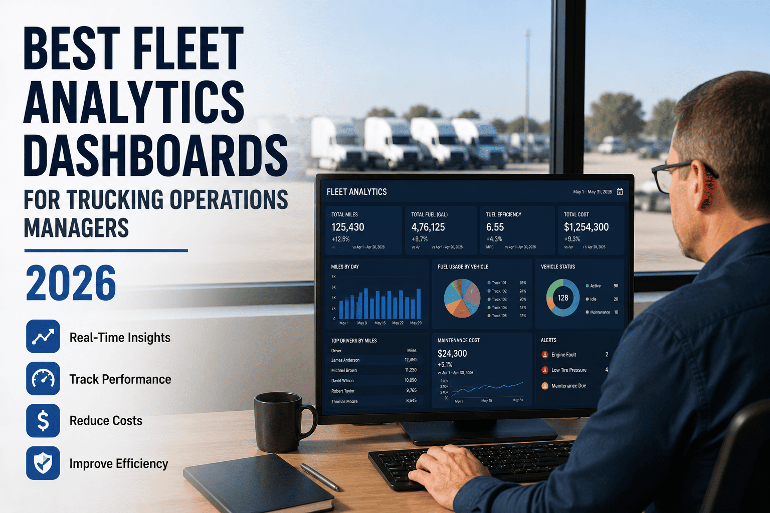
Most fleet operations managers don't have a data problem. They have a noise problem. GPS pings, fuel receipts, maintenance invoices, and driver logs all roll in every single day, yet by the time someone exports it all into a spreadsheet on Friday, it's already stale. A good analytics dashboard fixes this by surfacing the handful of numbers that actually move your margin, in real time, without you asking for them.
What Actually Makes a Dashboard "Good" in 2026
Operations managers don't need more charts. They need fewer charts that mean more. The fleets pulling ahead this year aren't tracking 30 metrics with equal weight, they're tracking four "north star" numbers front and center, with everything else just one click away. If your current screen looks like a control panel from a power plant, that's not thoroughness, that's the reason nobody opens it on a Tuesday.
The Four Numbers That Actually Run Your Fleet
Why these four and not the other twenty
Cost per mile tells you the outcome. Utilization, downtime, and PM compliance tell you why that outcome is happening. Everything else, fuel by route, idle hotspots, driver scorecards, is diagnostic detail that should sit one click below these four, not competing with them for attention on the same screen.
FleetRabbit pulls cost per mile, utilization, downtime, and PM compliance into one live screen, refreshed automatically from the data your fleet already generates. Sign up free and see your real numbers in minutes, or book a quick demo if you'd rather talk it through first.
Comparing the Dashboard Approaches Operations Managers Actually Use
Not every "analytics dashboard" on the market is built the same way. Some are glorified GPS maps with a few charts bolted on. Others genuinely connect cost, maintenance, safety, and utilization data so one number explains another. Here's how the common approaches stack up against what a 2026 operations manager actually needs day to day.
| Dashboard Type | What It Actually Shows | Update Speed | Best Fit |
|---|---|---|---|
| Spreadsheet Exports | Whatever someone manually pulled last Friday from five different systems | Weekly, already stale on arrival | Fleets under 10 vehicles with light complexity |
| GPS-First Tracking Tools | Live vehicle location with basic speed and idle alerts | Real-time location, but limited KPI depth | Dispatch-heavy operations needing location more than cost insight |
| Maintenance-Only Platforms | Work orders, PM schedules, and parts history in isolation | Real-time on maintenance, blind on cost and safety | Shops managing service, not full P&L ownership |
| Unified Analytics Platforms | Cost, utilization, downtime, PM compliance, and safety connected in one view | Real-time, automatic, no manual entry | Operations managers accountable for margin, uptime, and compliance together |
Five Things to Check Before You Pick One
A demo can make almost any dashboard look impressive for ten minutes. The real test is whether it holds up on a chaotic Tuesday when three trucks are down and a customer is calling. Here's what separates the dashboards worth paying for from the ones that just look good in a sales deck.
What a Well-Built Dashboard Actually Saves You
The dollar case for switching off spreadsheets is rarely subtle once you run the numbers for your own fleet size. A single cent of cost-per-mile improvement on a 50-truck fleet running 80,000 miles a year works out to roughly 40,000 dollars annually. Most operations teams that move to real-time KPI tracking land 2 to 5 cents of improvement within the first year, just from catching problems while they're still cheap to fix.
A Quick Way to Picture It
Imagine two fleets of identical size. One runs on a Friday spreadsheet. The other runs on a live dashboard. By month six, the live-dashboard fleet usually shows a lower cost per mile, fewer surprise breakdowns, and a noticeably cleaner safety record, even though both fleets started with the same trucks and the same drivers. The only difference is how fast each team could see a problem and fix it before it got expensive. That gap is exactly what a good dashboard is built to close, and you can sign up to start measuring it on your own fleet today.
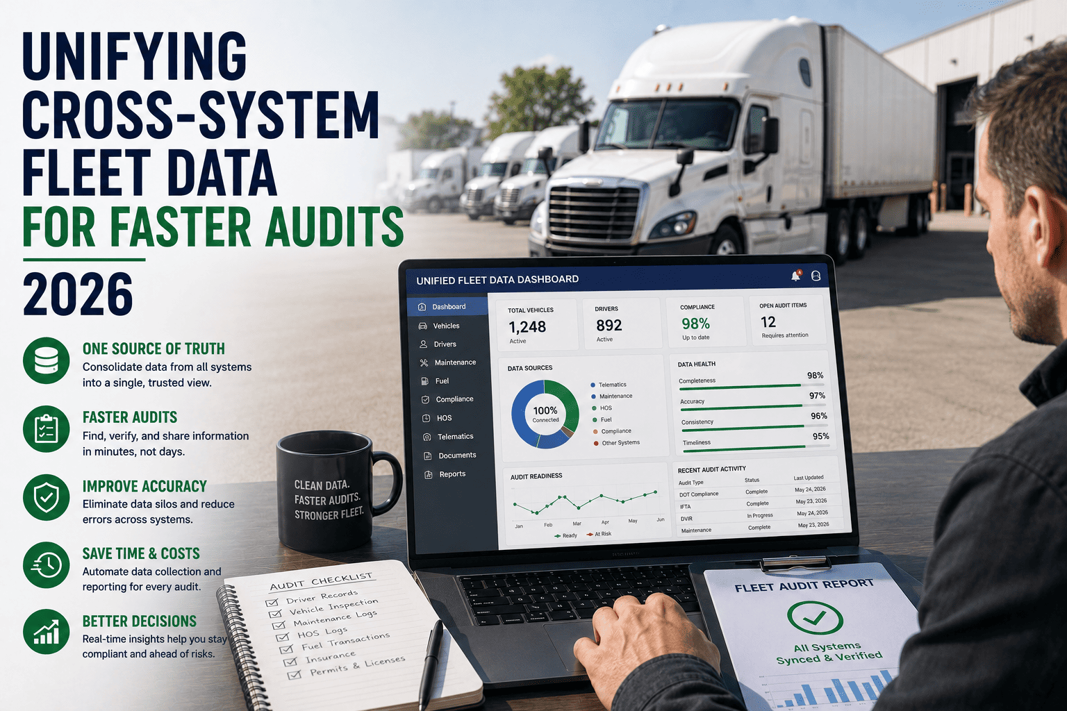
FleetRabbit connects your existing telematics, fuel, and maintenance data into a single live dashboard built around the four numbers that actually move your margin. No re-entry, no weekly export, no guesswork. Book a 30-minute demo and we'll configure it around your fleet size live on the call.
Frequently Asked Questions
The Bottom Line
The fleets pulling ahead in 2026 aren't the ones with the most data. They're the ones who cut their dashboard down to the four numbers that matter and built a habit of actually looking at it. Cost per mile tells you the score, utilization, downtime, and PM compliance tell you why, and everything else is detail you can pull up when you need it, not noise you have to wade through every morning.
If your current setup still means exporting five systems into a spreadsheet before you can answer a simple question about your fleet, that gap is costing you more than it feels like day to day. The fix doesn't require ripping out your existing telematics or fuel cards, it just requires putting one clear screen in front of the people making decisions.
FleetRabbit turns your existing fleet data into one live dashboard built around cost per mile, utilization, downtime, and PM compliance, the four numbers that actually predict where your margin is headed. No spreadsheets, no manual entry, no waiting until Friday.