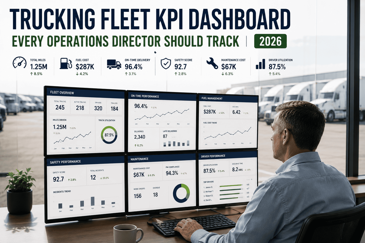
Most fleet managers can tell you their bank balance at the end of the month. Far fewer can tell you, right now, whether their cost per mile is climbing, which trucks are quietly eating margin through low utilization, or whether preventive maintenance compliance has slipped enough to trigger the next round of breakdowns. That gap between "knowing the numbers" and "watching a live scoreboard" is exactly what separates fleets that grow from fleets that just survive. A well-built KPI dashboard turns scattered spreadsheets, driver logs, and maintenance tickets into one clear picture an operations director can act on the same day a problem appears.
A high-performing trucking fleet KPI dashboard tracks four "north star" numbers at a glance: cost per mile, vehicle utilization, unplanned downtime, and PM compliance. Fleets tracking these metrics in real time report roughly 20 to 30 percent lower cost per mile and meaningfully higher uptime than fleets still relying on monthly spreadsheet reviews. Everything else on the dashboard should exist to explain why those four numbers are moving.
Why Operations Directors Can't Run 2026 Fleets on Gut Feel
Fuel prices shift weekly, freight rates compress, and a single unmonitored truck can drag down an entire route's profitability without anyone noticing until the quarterly review. Operations directors who still pull numbers from three different spreadsheets are always reacting a month late. A live fleet KPI dashboard closes that gap by pulling telematics, maintenance records, fuel cards, and dispatch data into one screen, so a dip in performance shows up in hours, not weeks. If you want to see what that kind of visibility looks like on your own fleet, you can sign up for a free trial and connect your first vehicles in minutes.
The Four Pillars of a Balanced Scorecard
Every useful fleet KPI falls under one of four pillars. Lean too hard on any single one and you optimize one number while quietly damaging another, for example cutting maintenance spend to improve cost per mile, only to watch downtime and safety incidents climb months later.
FleetRabbit connects your telematics, maintenance logs, and fuel cards into one dashboard, so cost per mile, utilization, and downtime update automatically instead of waiting for the Friday spreadsheet. Start with 3 vehicles and see your first live numbers in under an hour.
The 8 KPIs Every Fleet Dashboard Should Track
Tracking twenty metrics with equal visual weight is a common reason dashboards stop getting opened. The fix is a tiered layout: a handful of KPIs shown large at the top of the screen, with everything else available through a click. The eight below cover nearly every operational decision an operations director needs to make.
| KPI | What It Measures | Target Benchmark | Why It Matters |
|---|---|---|---|
| Cost Per Mile | Fuel, maintenance, insurance, and labor divided by total miles | $1.50 to $2.50 for most FTL fleets | The master profitability number behind every routing and pricing decision |
| Vehicle Utilization | Percentage of available hours or miles a truck is actively earning | Above 80 percent for best-in-class fleets | Below 50 percent, a truck eats insurance and depreciation without paying for itself |
| Unplanned Downtime | Hours a vehicle sits idle from unscheduled breakdowns | Under 5 percent of scheduled operating days | Directly reduces revenue capacity and triggers emergency repair costs |
| PM Compliance Rate | Percentage of preventive services completed on schedule | Above 90 to 95 percent | A leading indicator; low compliance roughly doubles or triples breakdown rates |
| On-Time Delivery | Percentage of loads delivered inside the promised window | Above 95 percent | The single KPI most closely tied to customer retention and contract renewal |
| Fuel Efficiency | Miles per gallon by vehicle and by driver | Varies by class and route type | Fuel typically represents 30 to 40 percent of total operating cost |
| Mean Time Between Failures | Average miles or hours between unplanned breakdowns | Rising trend, tracked by asset class | Reveals which vehicles or components need targeted investment |
| Driver Safety Score | Harsh braking, speeding, and inspection compliance | Improving trend month over month | Drives insurance premiums and long-term driver retention |
North-Star Metrics vs. Diagnostic Metrics
Not every KPI deserves the same spot on the screen. Cost per mile, vehicle utilization, unplanned downtime, and PM compliance are your north stars, the numbers a director should be able to read in under five seconds. Fuel efficiency, MTBF, idle time, and inspection compliance are diagnostic metrics that explain why a north star is moving. When cost per mile creeps up, the diagnostic layer tells you whether the cause is fuel, unplanned repairs, or underused trucks, without digging through a separate report.
A Quick Example
Say utilization drops from 85 to 68 percent on one truck. On a spreadsheet, that number sits quietly until someone happens to notice it. On a live dashboard, it triggers a flag, and the diagnostic layer often shows the real cause is a maintenance backlog, not a routing problem. Fixing the actual cause, rather than guessing, is the difference a connected dashboard makes.
What Happens When PM Compliance Slips
Preventive maintenance compliance quietly drives nearly every other number on the dashboard, which is why it deserves its own spotlight. Moving PM compliance from around 70 percent to the mid-90s typically cuts breakdown rates by roughly half within 90 days, which then lowers emergency repair spend, shortens downtime, and pulls cost per mile back down as a result.
Scheduled services get delayed or skipped during busy weeks
Small issues turn into roadside failures
Emergency labor and parts pricing kick in
The north-star number moves last, but it always moves
This is exactly the kind of chain reaction a connected dashboard catches early, instead of surfacing it only after cost per mile has already climbed. If you'd like to walk through how this looks for a fleet your size, you're welcome to book a demo and bring your own maintenance data to the call.
Three Mistakes That Quietly Break Fleet Dashboards
The Dollar Case For Fixing These Mistakes
A single cent of cost-per-mile improvement on a 50-truck fleet running 80,000 miles a year works out to roughly $40,000 annually. Most operations teams that move from spreadsheets to a real-time KPI dashboard land 2 to 5 cents of improvement in the first year, simply from catching problems while they're still cheap to fix. On a fleet that size, that's a six-figure swing driven almost entirely by better visibility, not by buying new trucks.
FleetRabbit builds your dashboard around cost per mile, utilization, downtime, and PM compliance, with fuel, safety, and maintenance data one click away for the full picture. No spreadsheets, no waiting for the monthly report.
Getting Started: A Simple Rollout Plan
Building a dashboard doesn't require ripping out your existing systems. Most operations directors get a working scorecard live within a few weeks by following the same three-step path.
Ready To See It On Your Fleet
You don't need to overhaul your operation to get value from a real-time dashboard. Most teams see their first meaningful signal, a truck under-utilized or a compliance rate slipping, within the first week of connecting data. When you're ready, you can sign up and start a free trial with your own fleet, or if you'd rather see it configured for your exact fleet size first, book a 30-minute demo with our team.
Every week without a live KPI dashboard is another week of finding out about problems after they've already cost you money. FleetRabbit puts cost per mile, utilization, downtime, and PM compliance on one screen, updated in real time, so you can act while it's still cheap to fix.